TL;DR
Understanding the psychology behind visual branding elements can transform how customers perceive and connect with your brand, driving both recognition and revenue.
Why Beautiful Branding Works Before You Even Say a Word
Beautiful branding works because it speaks to something deeper than logic. The moment someone sees your brand, decisions happen in a flash. Ninety percent of those snap judgements come down to colour alone. Your website design shapes up to 75% of credibility perceptions before anyone reads a single word.
At 044 Bureau, our approach to branding has been shaped by more than a decade of solving the same problem for founders: brands trying to say too much and losing their audience in the process. We believe stripping away the unnecessary isn’t about minimalism for its own sake. It’s about clarity, and clarity builds trust. This ‘Less But Better’ mindset has become a business strategy that delivers measurable results — whether for boutique hospitality, skincare, or wellness brands.
We see branding as visual psychology in action. Every colour choice, every curve, every font creates an emotional response your audience feels before they think.
The science behind what makes people stop and stare is not mysterious. It is about how the human brain processes visual information and responds to design. This includes colour theory, the psychology of shapes and fonts, and why some brands become instantly recognisable while others fade into the background.
Sharp strategy and visual storytelling are where the magic happens.
The Psychology of Colour in Branding
Colour speaks before words do. It is the first conversation your brand has with someone’s subconscious, happening in milliseconds.
- Red does more than catch attention. It accelerates physiology. Heart rates quicken and urgency builds. McDonald’s bright red signals appetite and speed, tapping into embodied psychology.
- Blue owns corporate trust. Forty-three percent of Fortune 500 companies use blue as a visual shorthand for security and reliability. Facebook, IBM, and American Express all benefit from its quiet confidence.
- Yellow radiates optimism. It cuts through visual noise faster than any other hue, delivering warmth and possibility. Snapchat’s yellow is strategic joy, designed to make interactions feel lighter.
- Green breathes calm. It is the easiest colour on the eyes, acting as a gentle anchor in visual chaos. It communicates health, growth, and tranquillity without a word.
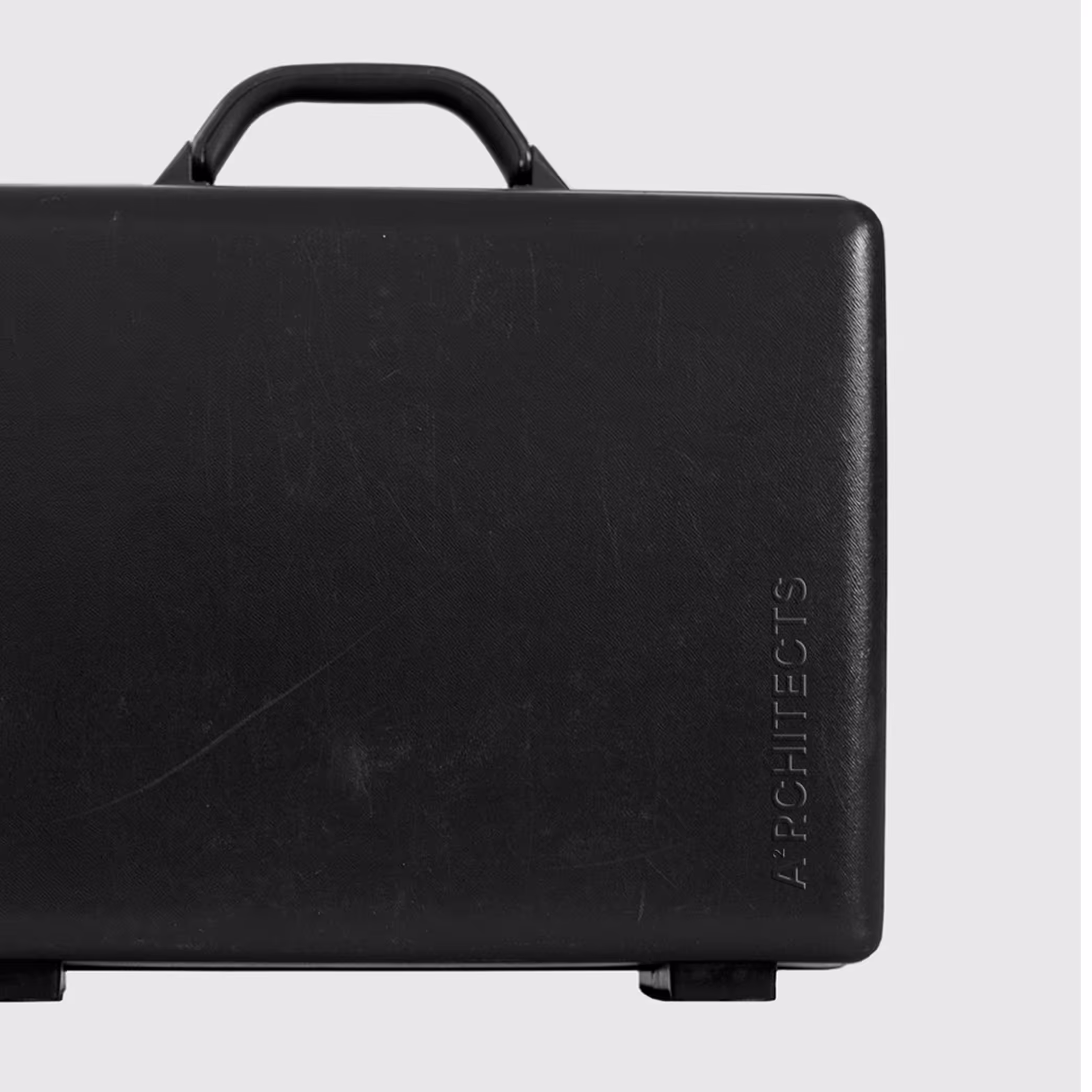
- Black signals luxury. Premium brands using stark black-and-white palettes create psychological distance that makes exclusivity feel tangible.
Your colour choice is not decoration. It is brand psychology at its purest, shaping how people feel about your business before they know what you do.
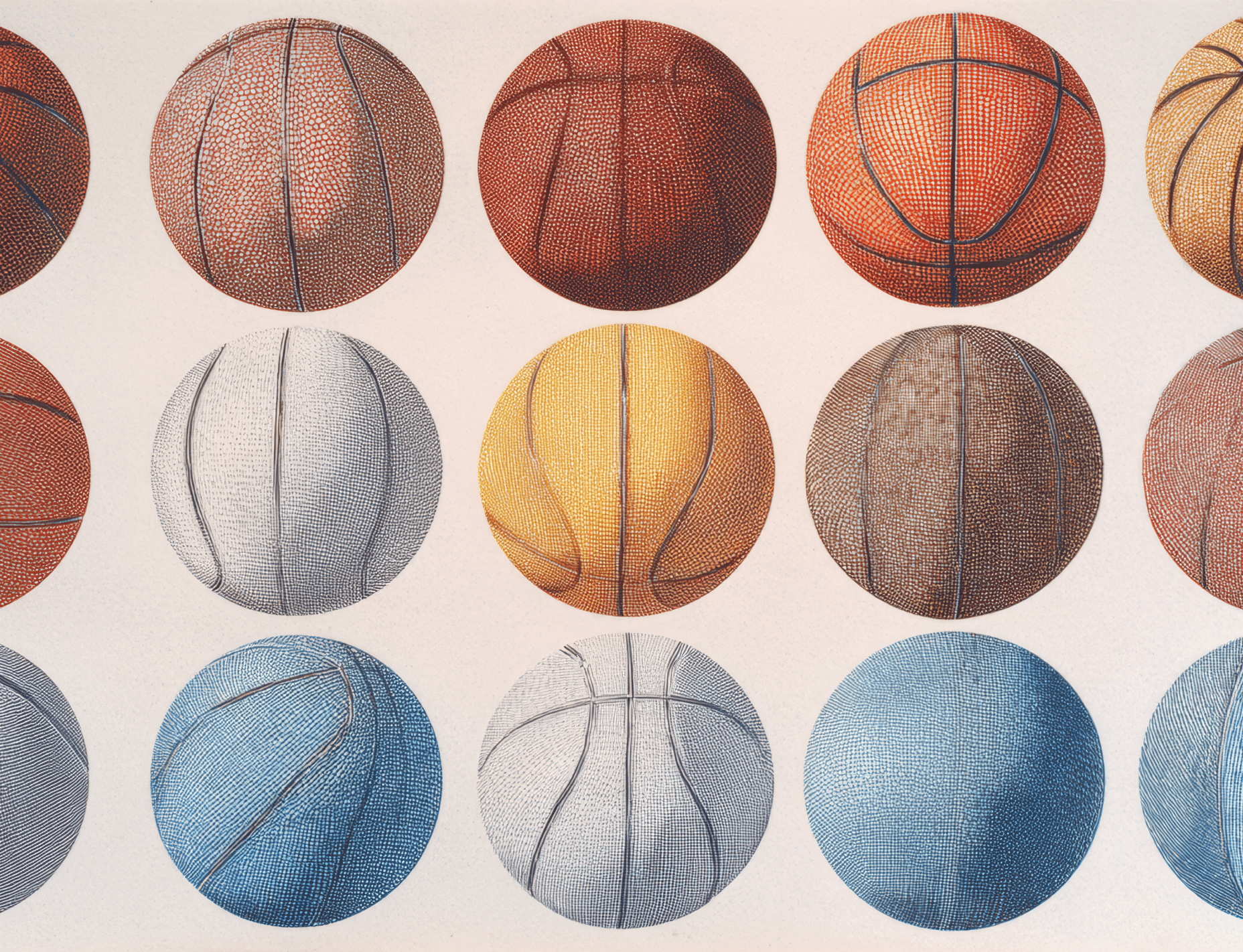
Shapes, Fonts, and the Subconscious Impact
Geometry speaks before words do. The curves in your logo, the angles in your design — they're having quiet conversations with your audience's subconscious. Studies show that the shapes you choose directly impact how customers perceive your products.
Circles create feelings of warmth, approachability and unity. There's something inherently human about brands with circular logos — they appear caring, sensitive and comforting. No sharp edges means no psychological barriers. Trust flows easier.
Angular designs tell a different story. They signal competence, individuality and psychological distance. Triangles shift meaning based on their orientation:
- Upright triangles represent stability, power and upward momentum
- Inverted triangles suggest instability or downward motion
- Side-pointing triangles indicate movement and direction
Squares and rectangles anchor your brand in reliability. They communicate stability, strength and trustworthiness — which explains why financial institutions lean heavily on these shapes.
Typography carries its own psychology. Serif fonts — those with small decorative flourishes — make brands feel established, formal and rooted in tradition. They also improve readability in smaller sizes.
Sans serif fonts create perceptions of modernity, simplicity and accessibility. Google's shift from serif to sans serif reflects this understanding — contemporary brands choose clean lines to feel approachable.
Script fonts whisper luxury. They convey elegance, prestige and sophistication. Fashion brands understand this language, often pairing bold visuals with minimal, refined typography.
Every shape, every letterform works silently. Consider these subconscious currents when crafting your visual identity.
Even under strict industry regulations, such as supplement labelling requirements, design can retain its clarity and premium feel.
Emotional Branding and Visual Consistency
Less selling, more feeling. That's what separates brands that stick from those that fade.
Emotional connections drive decisions in ways logic never could. We're talking about 95% of purchasing choices happening in the subconscious, with emotions steering 70% of buying behavior. The brain processes images faster than words, which means your visual identity creates feelings before anyone has time to think.
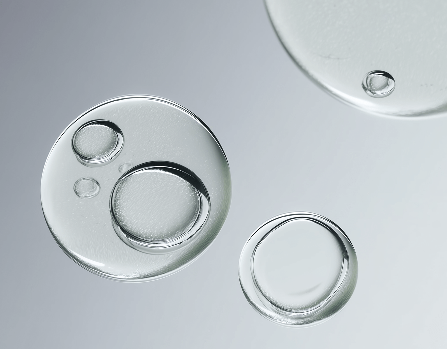
A good example is our work with our client Formula, a wellness brand built on purity and essentiality. In an industry crowded with flashy, overdesigned packaging, we created a clean, monochrome identity paired with a transparent bottle that put the product itself front and centre. The result was immediate: the design earned an ODA Gold Award and drove a 30–40% increase in inbound inquiries from wellness and lifestyle brands seeking that same clarity-led, premium feel.
Additionally, Nike gets this. They don't sell shoes -they sell the story of what you could become. "Find Your Greatness" is about the person you see in the mirror after you lace up. That swoosh hits something primal, something automatic.
It's visual shorthand for possibility.
Here's where consistency becomes your secret weapon. Brands with cohesive visual identities see 23% higher revenue because recognition builds trust, and trust drives loyalty. Every touchpoint should tell the same visual story - your website, your packaging, your social presence. When someone encounters your brand, they should know it's you instantly.
Think about Coca-Cola during the holidays. Those red trucks, that script font, the way they make December feel like home. Sixty years of visual consistency means their brand lives in our collective memory. Apple does something similar — clean lines, white space, that quiet confidence that makes you want to belong. Their customers don't just buy products; they buy into an identity.
Visual consistency signals something deeper than professionalism. It shows you know who you are. When every element aligns — when your colours, typography, and imagery speak the same language — people develop trust without realizing why. Consistency manages expectations and delivers on promises at every single interaction.
The best brands get this. They know that emotional connections require visual reliability.
Conclusion
The science behind beautiful branding isn't about following rules - it's about understanding intention. Every visual choice creates a feeling before it communicates a message. Less guesswork, more psychology.
When you select colors, shapes, and fonts with purpose, something shifts. Casual viewers become curious. Curious viewers become customers. The difference lies in recognizing that branding is visual storytelling, and every element plays a part in that story. As Michelangelo said, there is a statue in every block of stone - you just have to remove the unnecessary to reveal it. At 044, we apply the same thinking to branding. If an element doesn’t have a clear reason to exist, it’s taking away from the whole. The balance of creation and reduction keeps the focus on what’s essential, ensuring every choice is intentional and relevant.
Consistency ties it all together. Your website, packaging, and social presence should feel like chapters in the same book. This isn't about perfection — it's about cohesion. About making the complex feel effortless while every touchpoint reinforces who you are.
Visual branding works at the subconscious level because that's where decisions live. The psychology is clear, the applications are endless, and the results speak for themselves. When strategy meets creativity, brands don't just look good — they connect.
Ready to create branding that makes people stop and stare? Let's chat
FAQs
Q1. How does color psychology influence brand perception? Color plays a crucial role in brand perception, with up to 90% of snap judgments about products based on color alone. Different colors evoke specific emotions and associations. For example, blue conveys trust and reliability, while red stimulates urgency and appetite.
Q2. What impact do shapes have on brand identity? Shapes in logos and branding elements communicate subconscious messages. Circles create feelings of warmth and unity, while angular designs convey competence and innovation. The choice of shape can significantly influence how customers perceive a brand's personality and values.
Q3. How important is visual consistency in branding? Visual consistency is crucial for effective branding. Companies with cohesive visual identities across all platforms can experience up to 23% higher revenue. Consistent use of colors, typography, and design elements helps establish brand recognition, builds consumer trust, and manages customer expectations.
Q4. What role does emotional branding play in consumer decisions? Emotional branding is highly influential, with 95% of purchasing decisions occurring subconsciously. Successful brands focus on creating emotional connections rather than just selling products. This approach can lead to stronger customer loyalty and increased sales.
Q5. How do fonts affect brand perception? Font choice significantly impacts how a brand is perceived. Serif fonts often make brands appear established and traditional, while sans-serif fonts create perceptions of modernity and simplicity. Script fonts are frequently used by luxury brands to convey elegance and sophistication. The right font can reinforce a brand's personality and values.