We’ve seen it more times than we can count.
A founder launches with a name they love, a logo built on Fiverr, and a colour palette that made their heart skip.
But something starts to feel off. Feedback is vague.
And the brand that felt so alive at launch... now feels like a placeholder.
This guide isn’t here to shame you. It’s here to gently hold the mirror up; and help you correct course and help you correct course with brand clarity, not chaos.
Let’s walk through the most common branding mistakes early-stage founders make, and how to avoid them with intent and artistry.
Are you trying to design before you define?
You’re in Canva, dragging boxes around. You picked a font you liked on someone else’s site. You have a moodboard, but not a mission.
This is the number one mistake: building visual assets without defining the emotional and strategic spine of your brand.
Without a clear direction on who you are, who you serve, and what you stand for, even the prettiest logo is just decoration. EU-Startups highlights this disconnect as one of the most common errors made by early founders: launching design before clarifying identity.
Start with strategy. Define your values, voice, positioning, and promise - before you design anything. This gives your visuals meaning, and your story cohesion.
Is your brand changing every time your mood does?
Your Instagram grid has five fonts. Your site just changed colors - again. You tweak language weekly.
Lack of brand guidelines leads to inconsistency, which quietly chips away at trust.
Your audience can’t form a relationship with a brand that keeps changing clothes.
Here is what to do to build brand clarity
Part 1: The Cognitive Fluency Framework
Most brand guides focus on visual consistency, but the real power lies in cognitive fluency - how easily information is processed.
When your brand feels "easy" to understand, people unconsciously assign it higher value, trustworthiness, and likeability. This guide reveals how to engineer cognitive fluency into every aspect of your brand experience.
The 5 Fluency Dimensions
Perceptual Fluency (how easily your brand is physically processed)
↓
Conceptual Fluency (how easily your brand is mentally categorized)
↓
Linguistic Fluency (how easily your brand language is processed)
↓
Emotional Fluency (ow easily your brand evokes feelings)
↓
Temporal Fluency (How easily your brand is remembered over time)
How a Clear Brand Strategy Helped Planner AI Connect Authentically
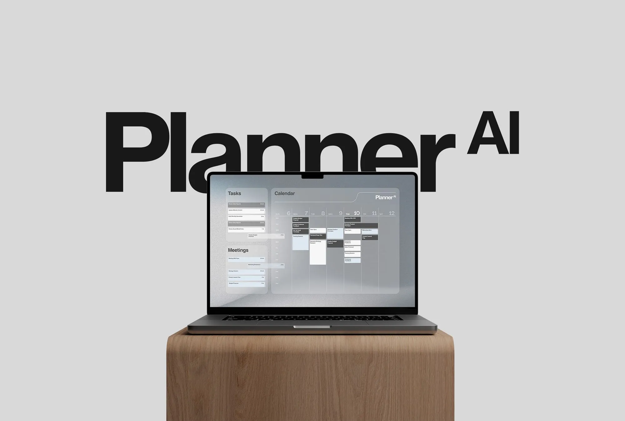
We partnered with Planner AI, a startup blending technology and wellness to help people manage their time more effectively. Together, we refined their brand story to clearly communicate how they create calm, stress-free schedules tailored to individual lifestyles. The brand voice we developed strikes a thoughtful balance between precision and warmth, while the visual identity draws on natural elements to express both innovation and stability. This clarity helps Planner AI connect deeply with its audience in a way that feels authentic and distinct. We worked with Planner AI, a startup that combines technology and wellness to simplify how people manage their time. When we began, their messaging was full of broad tech terms but lacked a clear, human connection. We focused on finding the core of what they offer — a way to create calm, stress-free schedules that fit real lives. From there, we shaped a brand voice that balances thoughtful precision with genuine warmth. The visual identity reflects this balance too, inspired by natural elements to suggest both stability and innovation. This clarity in voice and design helps Planner AI speak directly to the people they want to reach without feeling generic or overly technical.
This isn’t about starting over. It’s about getting clear.
These branding mistakes aren’t rare. They’re not shameful. They’re part of the process.
But clarity creates momentum. When your brand reflects your actual story - strategically and emotionally - you invite the right people in.
If this piece gave you language for what’s been quietly bothering you, let’s talk.
FAQ: Branding Clarity for Early-Stage Founders
What are the most common branding mistakes startups make?
Many early-stage founders jump into design before defining the emotional and strategic core of their brand. This can lead to visuals that look polished but lack depth—and messaging that feels scattered. Other common pitfalls include inconsistency, trend-chasing, and relying too heavily on a logo to carry the brand’s story.
How do I know if my brand needs a refresh?
If your brand no longer feels like you - or worse, if clients don’t quite “get it” - you’ve likely outgrown it. Maybe feedback feels vague. Maybe your aesthetic has shifted.
Do I need to redesign my logo to fix my brand?
Not always. A logo is an expression of your brand, not the definition of it. The deeper work lies in clarifying your voice, values, and position. When those are strong, a refined visual identity can emerge naturally.
Why is brand consistency so important?
Inconsistency sends mixed signals. If your tone, colour palette, or typography changes frequently, it erodes trust - your audience doesn’t know what to expect. Consistency isn’t about rigidity; it’s about helping people recognize and remember you.