Froot
Formula, a supplement brand, whose ethos is deeply rooted in the philosophy that optimal body function is achieved through purity and essentiality, with every other component being mere noise.
Visual Identity
Stationery Design
Formula, a supplement brand, whose ethos is deeply rooted in the philosophy that optimal body function is achieved through purity and essentiality, with every other component being mere noise.
Visual Identity
Stationery Design
To develop a visual identity that helps the brand stand out in the construction industry, the challenge was to create a design that is both inclusive and easy to understand for its target audience, primarily corporate businesses. At the same time, it needed to reflect the company’s young, modern approach and the innovation behind its product in the market.
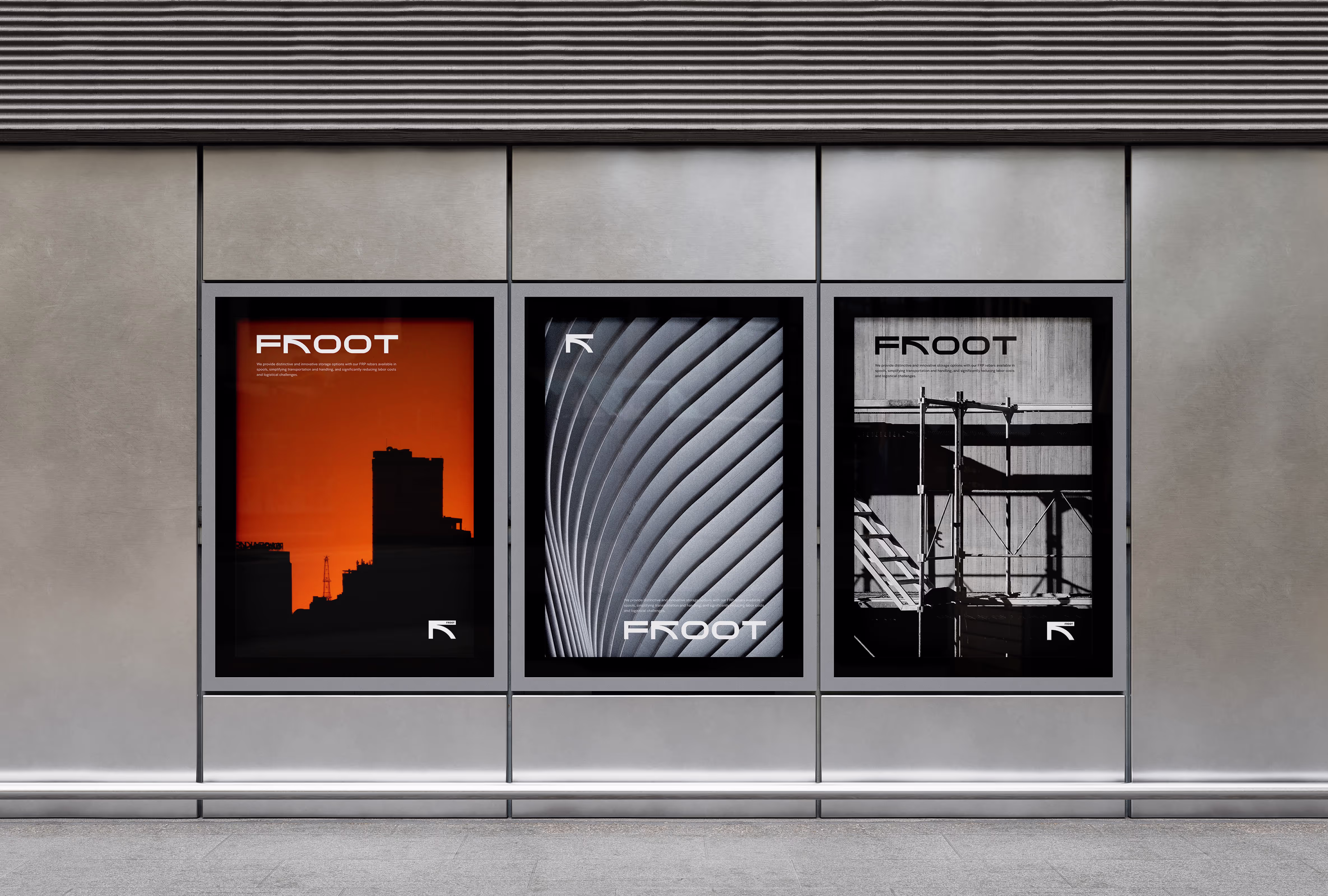
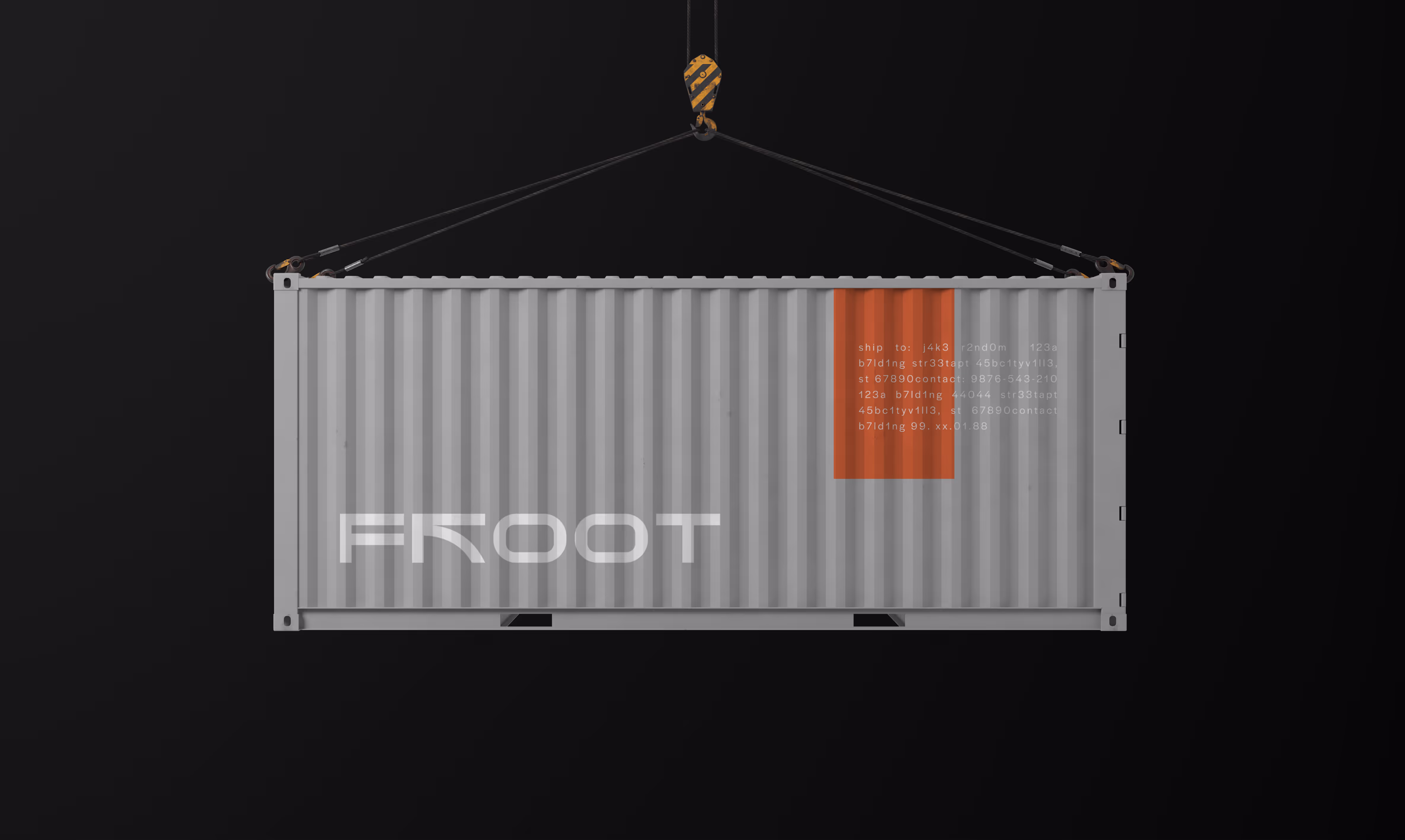
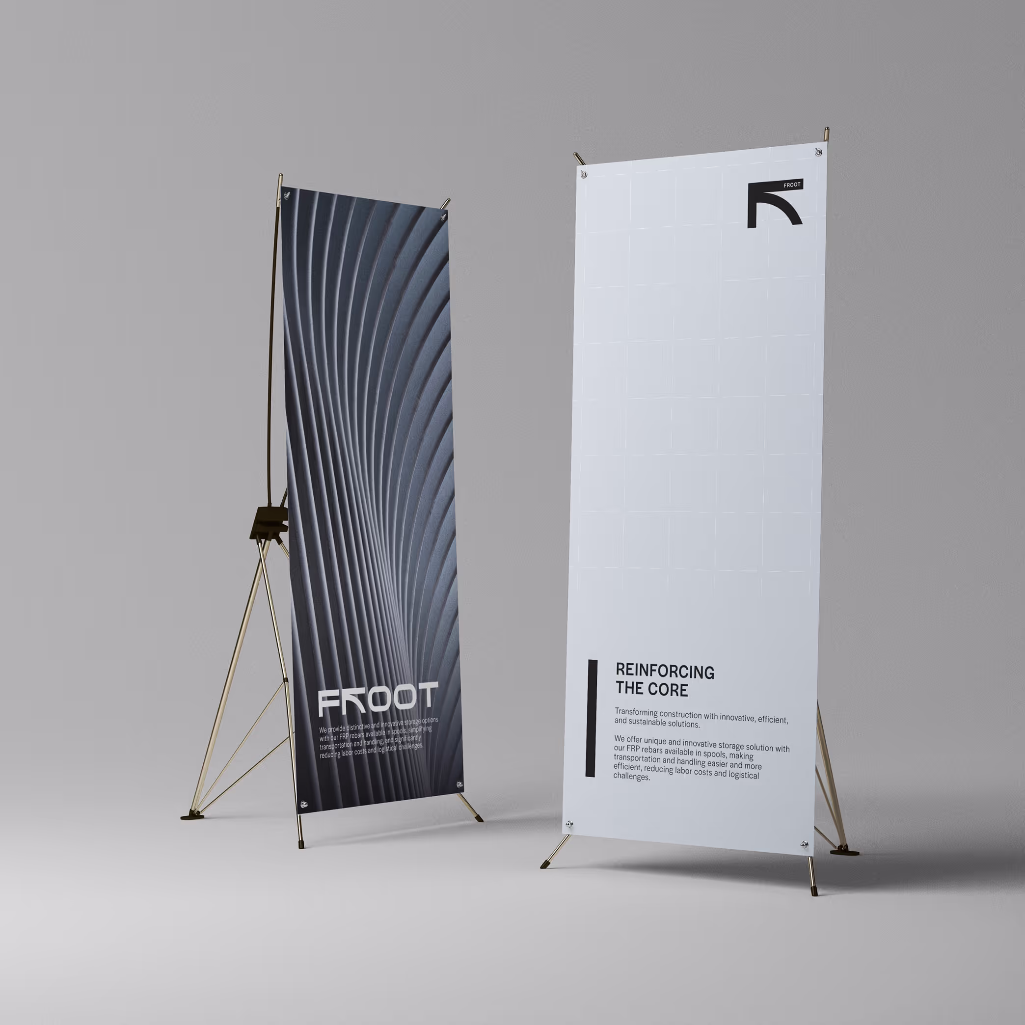
We approached the creation of this visual identity by analyzing the market and the essence of rebar materials. We chose orange, a color widely recognized in the industry, but refined its shade to create a more distinctive and fresh look. At the same time, we introduced a grey-blue hue, reflecting the color of stainless steel to reinforce the industrial nature of the business.
For the logo, we stylized the letter "R" and combined it with an arrow, symbolizing force in physics to enhance the brand's strength. Despite its bold appearance, the design incorporates a curved line, representing the product’s flexibility. Additionally, the two "O"s in "FROOT" are shaped to resemble a cross-section of rebar, further reinforcing the brand’s connection to the product.
Reach out — we’d love to hear from you!