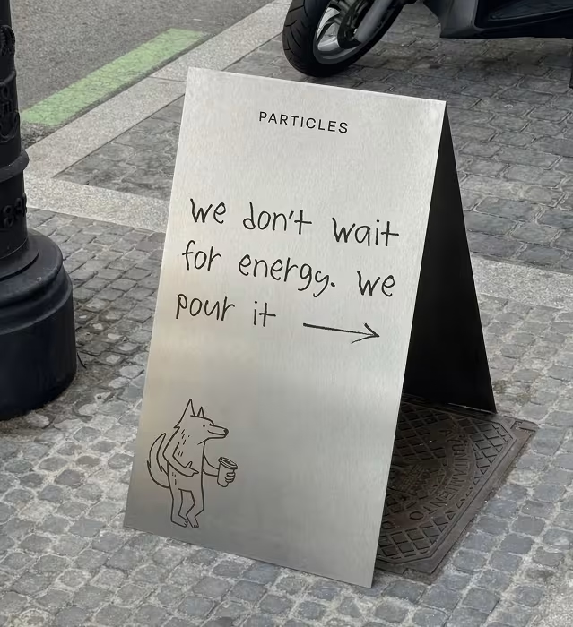
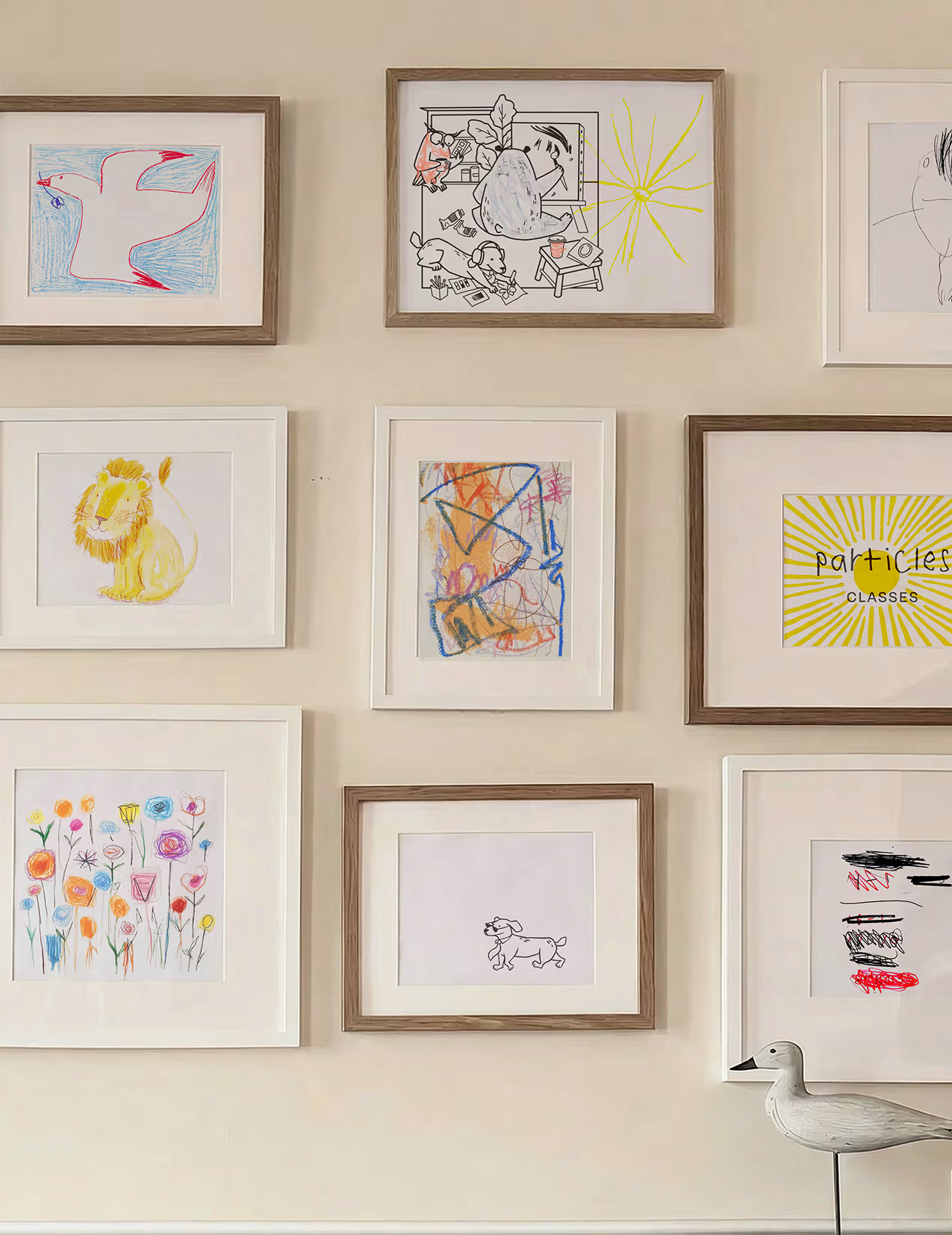
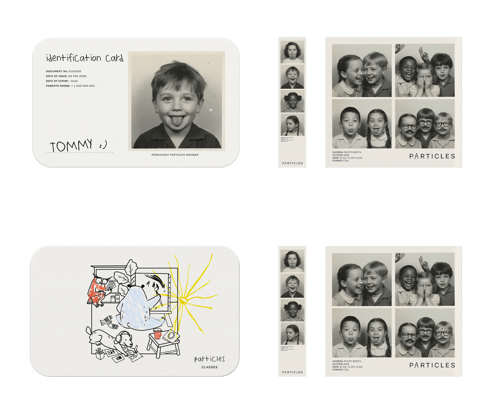
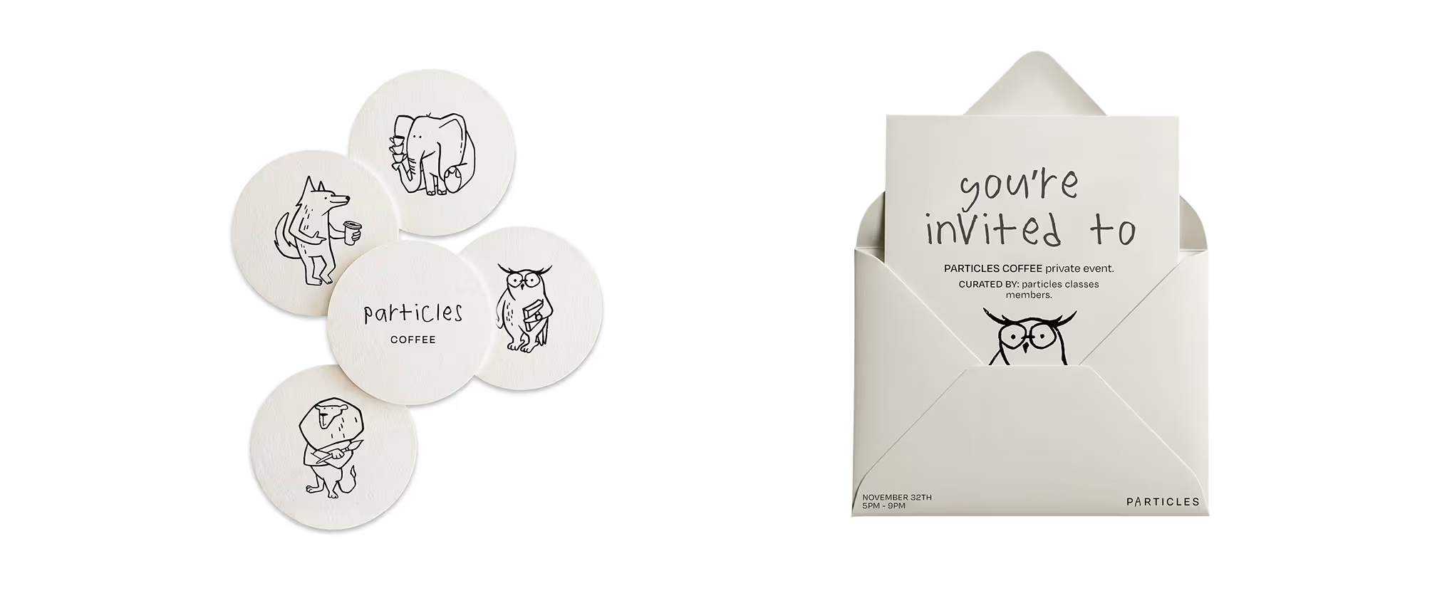
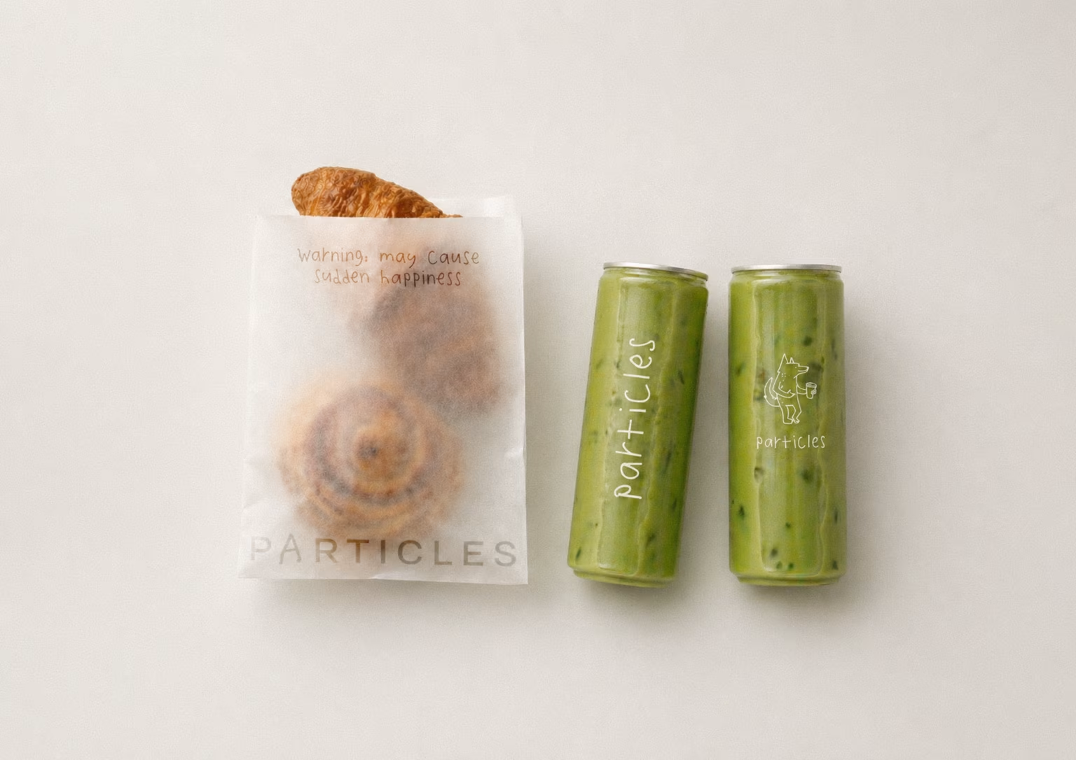
We started with strategy, building the brand DNA, positioning, and messaging around one insight: these are parents who love their children and also miss who they were before. The visual identity followed from there. We created six mascots representing courage, integrity, purpose, gratitude, resilience, and wisdom, brought to life through hand-drawn illustrations that feel personal and warm. They show up everywhere, from windows to merchandise to colouring sheets, becoming familiar faces for regulars. The coffee cups became a touchpoint worth talking about. Different designs, each carrying a message that finds you. Custom illustrations live in different corners of the space, layered with hidden details that reward a closer look. Each one reimagines a real area of Particles: the yoga room, the reading nook, the coffee bar. The palette is blue and peach, timeless and easy. The result is a brand that feels fun and a little naive.


.avif)